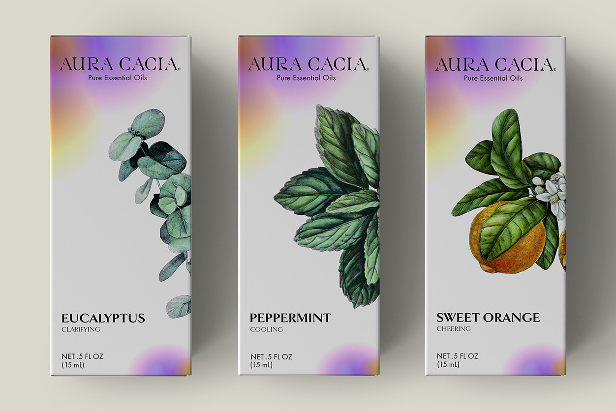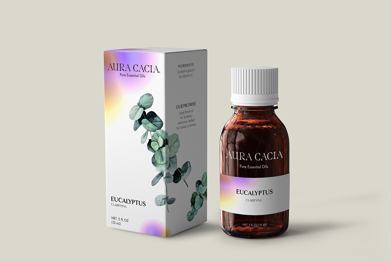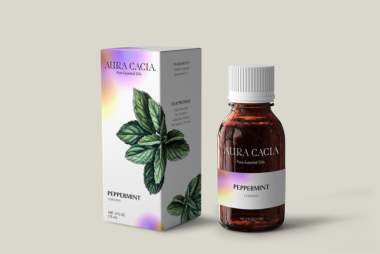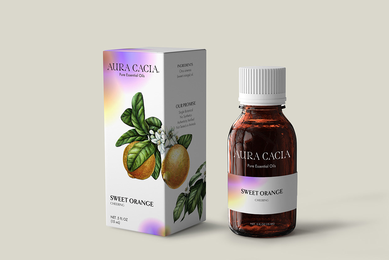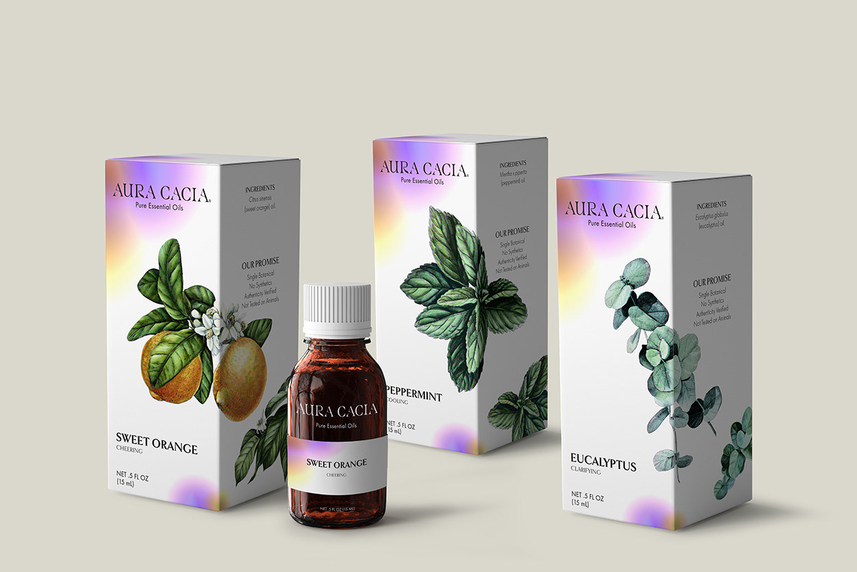
At Aura Cacia, they are motivated by the power of positive change, in their own lives & women everywhere. Focusing on their use of the highest quality essential oils and drive to create outstanding women, the brand has been updated to coincide with current trends. Inspired by posh boutique finds, the redesign is to predominantly attract women, young and old. With Aura Cacia's products easily accessible, a fresh design was needed to stand out in the aisles of day-to-day grocery store trips. The focus was on creating the illustration-like botanical images—inspired by vintage scientific journals. Alongside that, Aura Cacia’s logo felt bland, something easily looked over. The logo is simplified to a clean serif, while still touching on the use of natural ingredients, embellished by its stylized letters.
See the Design Process Here
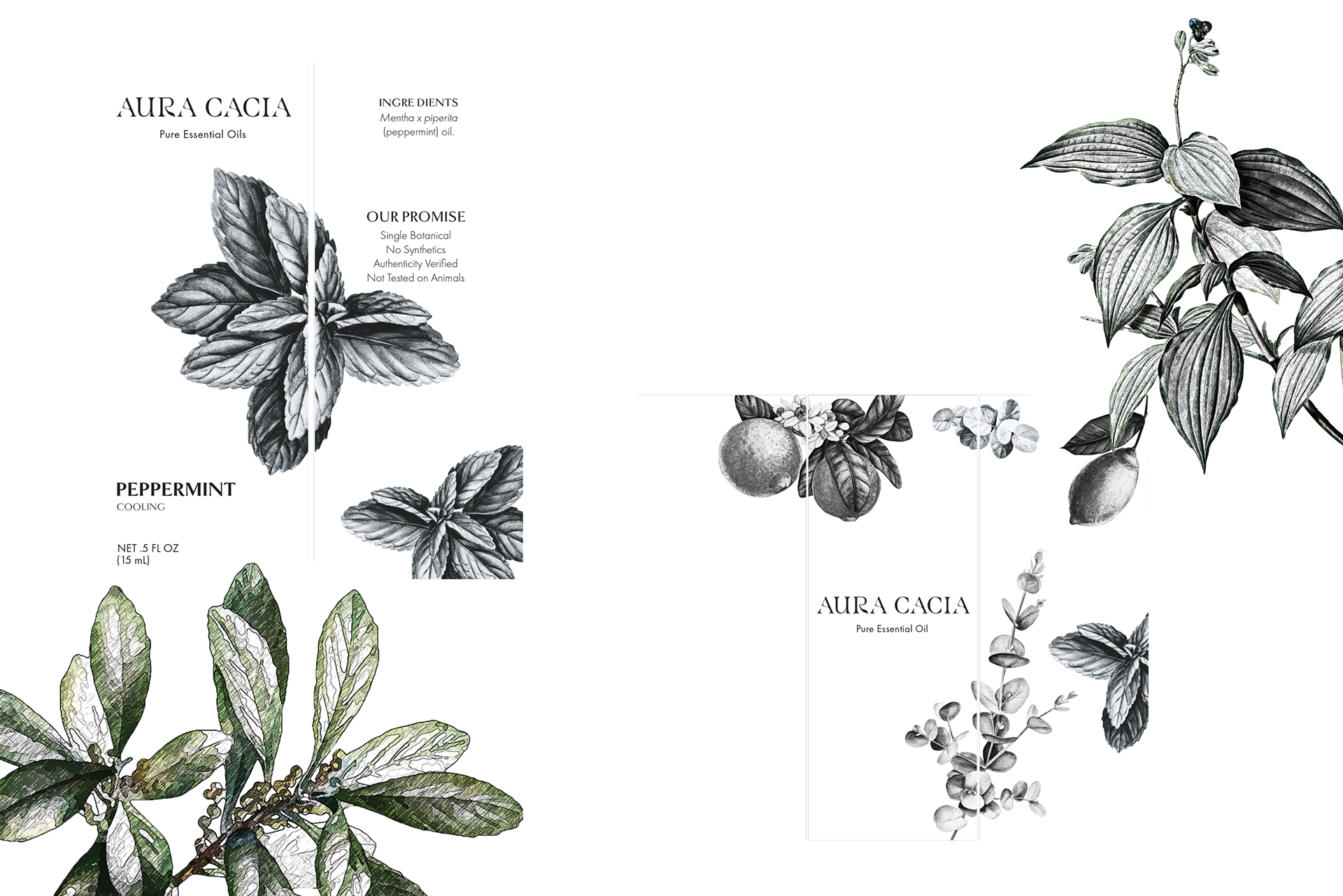
Original Logo